Showing posts with label Leia Urquhart. Show all posts

Wednesday, 28 March 2012

Characteristics, potentials and limitations of Lino

Characteristics of lino:
Smooth
Durable
Bendy
Tough
Hard
Flat
Thin
Reinforced
You can cut it/carve it

Potentials/Advantages:
Carve it
Print it
Emboss
Rubbings
Reduction printing
Tough/Sturdy 
Print onto different surfaces
Easy for simple designs or big size pieces

Limitations/disadvantages:
Mistakes are irreversible
It's not 3D
You have to work hard to get texture
Hard to cut
Limited colour application, rollers etc.
Hard to clean/hard to get off hands
Barrier cream for hands
White spirit -> fumes
Long time to dry
Time consuming
Difficult to carve in detail

Wednesday, 7 March 2012

Final paper installation

This is my group's final paper installation, it took us roughly three hours to create.  I think that this is a very interesting technique that can be interpreted in many different ways. A broad range of techniques have been used to create this paper installation, some parts of this piece have been created in 2D and some in 3D, some are brightly coloured, some are not so bright in colour, some details have been drawn on, some details have been cut out and stuck on. This mixture of techniques used makes the piece more interesting to look at which makes it very memorable. I particularly like the trees/bushes in the piece as they have been created by scrunching up tissue paper which gives a somewhat realistic effect. The only downside to this piece is that there is a lot of empty space which I believe needs to be filled to make the piece a lot more interesting, however there are a number of unusual and inventive techniques used which I think could be developed further.

Tuesday, 6 March 2012

Trip work

A quick observational sketch created using a black biro, of a building sitting upon the river Thames. I filled the background with patterns and distorted the building slightly in an attempt of trying out a simplified version of Lizzie Mary Cullen's work.

Yet another observational sketch in biro, this time using blue instead of black. This was a quick basic drawing of a clock that sits atop a building by the river Thames.

A collection of observational sketches of things in and around London's Southbank.

We were given guide books as we entered the exhibition and there was a point where  we had the opportunity  to emboss a page of the book with phrases that were related to the exhibition.

These are a selection of phrases from around the exhibition, I  took the phrases and wrote them out in fonts that I feel represent each phrase.

This is a phrase made up by myself, I left this piece of typography on a notice board at college.

This is a map of the United Kingdom, it is filled with images and words that represent my relationship with different areas of the UK.

There was a tiny, metal stick man outside a set of glass doors at the exhibition, this is my drawing of that stick man.

These are observational sketches of stuff around London's southbank. One is typography made out of lighting tubes and the other is of a ceramic egg.

A sketch of ceramic flip-flops from the exhibition.

A quick sketch of a piece of work from the exhibition, I found this piece very humorous,

Another quick sketch of a piece of work from the exhibition, this piece was amusing and memorable as well as being created in a very simplistic style.

Primary research visit


The exhibition was at the Hayward gallery at the Southbank centre, the artists exhibiting were David Shrigley and Jeremy Deller. Deller had the bottom floor gallery spaces and so his exhibition was the first we saw and Shrigley had the top floor galley spaces which meant that his exhibition was the second one we saw.
David Shrigley was trained as a fine artist in the department of Environmental Art at the Glasgow School of Art. He uses a very sketchy, basic style on purpose in his artwork. His work showcases witty and wry observations on everyday life. He uses a mixture of techniques including basic illustrations, paintings, animations, sculptures and mixed media pieces. I find Shrigley's work both humerous and witty.
Jeremy Deller studied 
Art History at the Courtauld Institute and at Sussex University where he did an MA. Deller uses a wide range of techniques in his work. In the exhibition, Deller explores humanity and his work is presented in interesting and sometimes very unusual ways including a 3D of bats flying in groups titled Exodus. Deller creates works with a wide range of collaborative groups.
My favourite piece of Shrigley's work is this piece:
I particularly like this piece because it is so simple yet it makes a point and in it's own way is rather humorous. It shows that a piece of artwork does not have to be complex in order to make a statement and have an effect on the audience of the piece. As Shrigley describes his work, this piece  "communicates as simply and directly as possible"
My favourite piece of Deller's work is this piece:
I particularly like the 3D film, "Exodus" as it was interesting, memorable and captivating for the audience of the piece. This was an unusual take on what is usually presented in an art and I think that Deller's approach to it was an effective one, the piece left people wondering what the meaning behind it was and many visiters to the gallery were interacting with one another and talking about what the film could represent.
My least favourite piece of work by Shrigley is this piece: 

I didn't particularly care for the dead, taxidermy animals around the gallery. The "I'm dead" comment was humorous, however I didn't like the use of the dead animals in the piece. The piece itself is a perfect example of Shrigley's unique style of work but I personally didn't care for the use of taxidermy, but that is just my personal opinion.
My least favourite piece of Deller's work is this piece:

I didn't overly care for this piece of work as I couldn't see the point in it really, although the free tea was enjoyable, I didn't fully understand how this piece fitted with the rest of Deller's gallery, I have researched and still don't completely get it. I would probably prefer this piece more if I could see a point in it.
Overall, I really enjoyed the exhibition. I was inspired by much of the work and I found the tasks we had to complete particularly interesting as they allowed me to involve myself with the artwork surrounding me and gave me the chance to immerse myself in the artist's exhibitions and gain a deeper understanding, interest and inspiration of the pieces than I would have done simply walking around and looking at them. 
This exhibition was relevant to the exam theme of "Combinations and alliances" as the two artist's work complemented each other in their quirky yet meaningful style however they also had an interesting contrast of techniques. 

Ana Serrano analysis

This is a piece by the artist Ana Serrano, it is a Doughnut shop front made out of card and paper as well as having a photographic element to it as well. I really like how the artist has tried to capture an object from life and recreate it in a smaller scale. The photographs on the windows give the illusion that there is actually an inside to this shop  and makes it look more realistic and like an actual scene from life. This piece has a very handmade feel to it, you can tell that each piece has been cut out and stuck together by hand and the sign upon the roof which says "fresh donuts open all night" is written by hand. It's obvious that a lot of care and effort has been put into this piece of work as each small section of this piece has been made separately and arranged/stuck together to form the finished product. I am not certain whether this doughnut shop really exists or whether the artist created the design of the shop herself for the sole purpose of creating this piece. This piece could inspire me to create something similar during my exam, I am particularly inspired by the mixture of paper construction elements and photographic elements.

Analysis of Staples Sydney opera house installation

This piece has been created by Staples and is of the Sydney opera house, it is made up entirely of stationary. I really like this piece as it is very bright and eye-catching which makes it memorable, what also makes it a memorable piece is that it is created using such interesting and unusual materials. I particularly like the use of the blue post-it notes for the ocean and the sky as although they are very flat two-dimensional objects, they are layered in a way that gives the illusion of three-dimensions and depth to the piece. The use of colour is very good, I like how bright and bold the colours are, it gives this piece a happy, lively feel. The brightness of the colours and use of warm tones within this piece symbolise the warm, sunny weather of Australia and brings the piece to life as by looking at it you can almost feel the hotness of the scene radiating from the installation. A variety of techniques have been used in order to create this final effect, the broad range of materials and techniques really work well together and complement each other in an interesting way. This piece of work shows the creative side of stationary and proves that even mundane, every-day objects can be manipulated and put together to form something beautiful, complex and artistic. This piece is definitely an inspiration, I particularly like the way the bridge has been constructed from bull dog clips and other small solid objects that wouldn't normally be used in this way. I would love to have a go at creating a similar piece using other every-day objects or even experiment with stationary just like the artist has here. 

Sunday, 26 February 2012

In-depth analysis

Lizzie Mary Cullen-Chinatown
This piece is an illustration drawn in what looks like a mixture of fine-liner and ink, the style of this piece is incredibly detailed, rather surreal and monotonous. This entire piece is full of tiny details and intricate patterns which make it very interesting to look at and also makes this a very memorable piece of work as the amount of effort put into it is very clear, especially since it appears to have been drawn completely by hand. I really like the look of the surrealism in this piece, all the objects drawn in this piece appear to be warped which makes the piece very unusual and eye-catching, I would really like to do something similar in style to this piece for my final piece. The lack of colour in this piece gives it a dark, eerie feel which makes it very intriguing to look at.
This was drawn by an illustrator called Lizzie Mary Cullen, the majority of her work is created in this style, though she has produced some work in colour but I prefer the black and white drawings as they have a more mysterious feel to them. This piece is entitled "Chinatown" as it is an illustration of China town, I am assuming the china town in London as that is where Lizzie Mary Cullen is from. This piece is very complex and full of shading and detail, I think this my favourite illustration I have found so far on this course, it is created in a style that I find very memorable and interesting and I would really like to have a go at creating a piece like this.

Hennie Haworth- Buildings 1
This piece is entitled "Buildings 1" as it is the first of a set of illustrations drawn of buildings, the title is simple just like the style of the image itself which suits the piece. This piece appears to have been drawn in what looks like chalk pastels and either fine-liners or felt-tip pens, I really like the look of these pastels as they can be blended together to create tone and shadow as well as new shades and interesting effects and the contrast between the pen drawn sections and the pastel colour sections looks very effective and is rather unusual which makes this piece very memorable.The colours used in this piece are very bright which makes it eye-catching, I really like the look of the bright colours used, this piece could inspire me to use a mix of pen illustration and other mediums to create a contrast of bright and dark colours in my final pieces. This piece has been created by hand by a woman called "Hennie Haworth". She lives and works in London and studied illustration at Brighton university and now has a very extensive list of clients including Elle magazine, The Observer and Nickelodeon.This piece has a bright, happy feel to it which makes me think that it would would be suited as an illustration in a childrens' book or something similar.

David Ryan Robinson- Map of London (West)This piece is by "David Ryan Robinson" he is a an illustrator who lives and works in London, he attended the university of Salford and got first class BA (hons) in illustration and has many past clients including The times, EDF energy and sport relief, he is currently working as a designer for Cartoon Network as Turner enterprises. This piece appears to have been drawn entirely by hand using what looks to be blur biro, it is full of tiny details and shading and tone which makes it a very interesting and memorable piece as it is so complex and the amount of effort put into this piece of work is very clear. This piece has a touch of surrealism to it as among all the houses and roads and trees upon this map, there are cartoon characters of David Ryan Robinson's own design peeking out from random spaces and hidden within the piece which gives the viewer of the piece something to search for. I really like the style of this piece, it could influence me to create my own final pieces using biro, small details and hidden surreal elements.

Saturday, 25 February 2012

My Exam Brief

Why have you selected this brief?I have selected this brief because out of the 4 briefs available, this was the one I had the most ideas for and the one created in the style I am most confident in, Illustration.
What are you planning to look at for primary/secondary research?I am planning to look at postcards with illustrated designs on them and travel guides with illustrated designs upon them as well as posters and artists books.
Which artists/designers will you be looking at (you must select a minimum of 3 from the brief)Lizzie Mary Cullen, Hennie Haworth and David Ryan Robinson.
What materials/techniques would you like to experiment with? I would like to experiment with ink, water-colour, fine-liner, felt-pens and pencil. I would like to experiment with very detailed drawing mixed with rather simple designs to create an interesting contrast.
Which outcome(s) are you planning to make?I am planning to create 5 postcard designs.

Brief MoodBoards


Top left: London Illustration by Zoe Morre o'ferrall  Top right: "Piccadilly" by Lizzie Mary Cullen Middle Left: Illustration by Danny Allison Middle Right: "This one" by David Ryan Robinson Bottom Left: "Tower Bridge" by Lizzie Mary Cullen Bottom Right: London Illustration by Zoe Morre O'ferrall 


Top left: "Me" by Myself, Top middle: "Suitcase" by Kim Welling, Top Right: "These eyes of mine" by Myself, Middle Left: "Polardarium", Middle: "The beauty underneath" by Myself, Middle right: "The Joseph Cornell box", Bottom left: "Watchful coast" by Myself, Bottom middle: "Inner self tea" by Laura Donaldson Bottom Right: "Haunted" by Myself


Top Left: "Joy" by Yulia Brodskaya Top Right: "Weave" by Zim and Zou Middle Left: "L in Baskerville" by Emma King  Middle Right: "Home sweet home" by Debbie Smyth Bottom Left: "What I saw" by Alidia Rosie Sayer Bottom Right: "Back to Oz" by Maricor/Maricar


Top Left: Unofficial olympic games poster by Stephen Messham Top Middle:  Official Olympic games poster by Anthea Hamilton Top Right: Delhi commonwealth games logo Middle Left: Wolff Olins poster Middle: Glasgow 2014 commonwealth games logo Middle Right: Official Olympic games poster Bottom: Logo design works


Saturday, 28 January 2012

Final Project Evaluation


For my retail graphics project I had to come up with an idea for a shop, I decided to do a clothing shop as I shop most in clothing stores therefore would have a better idea of what to do for the project.
I am very fond of punk-clothing shops, particularly those in Camden so decided to do a punk-clothing store inspired by some of the brands that I visit/buy from often. For the project I had to design a logo for my company, packaging for my company and a swing-tag for my company.
These had to represent the shop well and my designs had to be memorable and interesting at the same time.
I decided to call my shop "Dead Bunny" because there are many very popular punk clothing stores that use the name of dead or evil animals and they seem to have a lot of success (bye bye kitty, hell bunny etc.) The design of my logo is a skull with rabbit ears which represents the name of the company as skulls represent death and being dead and the rabbit ears on the skull represent the bunny being dead.
I used bright, neon-like colours and black because they are the sort of colours used on items in my punk-clothing shop, therefore they match and it represents the image and the products of the company well rather than being a complete contrast to what is actually sold as that would be confusing/misleading for customers.


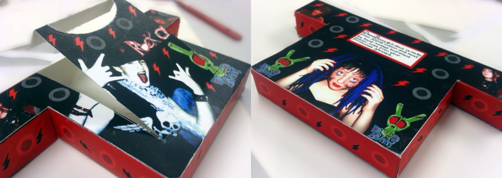
My packaging design evolved as I was going through the process of experimentation and development, my net design was inspired by what is sold in my company's shop, it's a clothing store so I decided to make it in the shape of a t-shirt as it seemed an interesting yet rather simplistic shape to use. During my initial experimentation I used many different materials and techniques to try and make my net design look interesting and creative. I started researching punk clothing stores online and found a shop called Underground, I really liked the style and design of this shop, I'm not sure which artist designed it, I tried to look it up online but couldn't find anything. I used the idea of having the colour scheme of black and red on my final packaging design, I also decided to add photographic elements to the piece because I found the work of Martha Robertson and Alfonso Sotelo rather interesting as I felt that the photographs used on their packaging design had an effective and memorable look.

My swing-tag design has one new designed element and other "recycled" (reused from other sections of the project) elements involved. I decided to give my swing-tag many layers as it makes it more interesting to look at and gives the design more depth. The front layer is of a hand and it has the company logo on it and sizing information about the garment purchased. The other layers are things that I have previously used in the project, a lightning bolt from my packaging design, the "Rock" from the "Rock on!" design on my packaging, the front t-shirt shaped section of my packaging design and my designed logo. Because all of these elements link to what has already been created during the product, the swing-tag clearly matches the design of my other designs for my store which makes them look like they are supposed to go with one another.

I think my packaging design was very good as it was interesting and memorable, however I feel that the actual packaging itself could have been better, I could have added more tabs to make sure that there are no gaps between the edges and I could have made the flap that opens, bigger so as to gain easier access to the contents inside.

Overall I felt that this was a very interesting project that allowed me to explore some rather interesting techniques that I probably wouldn't have explored beforehand, now however I feel that I may like to complete more packaging in the future, I think that it's a fun project to work on that gains very interesting results. 


Final swing tag design

This is my final design for my swing tag, it has improved since the first version. I have added many new elements to the piece, there is no longer only the hand. I decided to do this because it makes it more interesting and memorable as well as linking to my company well, there is now a clear link between my swing tag and my packaging design. I have now included the lightning bolt from my packaging in this design, the front t-shirt shaped segment from my box, the "Rock" from the "Rock on" typography that I created and my logo design  in my swing-tag design. I feel that this greatly improves the overall look of my piece.

Swing-tag design 1

This is my swing-tag design, I chose to do my swing-tag in the shape of a hand because
1) It seemed like an interesting and unusual idea
2) There was a hand on my packaging in the "Rock on" typography
3) It allowed me to show off some of the products on sale (accessories such as rings, nail stickers, cufflets etc.)
I started off by sketching out my design in HB pencil, I then outlined the design using a black fine-liner, once I had done so I scanned the image into my computer and opened it in Adobe Photoshop where I proceeded to colour the design using the fill tool and the paint brush tool. Once I had done so I went on to place my logo on my design and lower the opacity slightly so that it didn't look too bright compared to the rest of the design. Lastly I added a text layer above with the information I wanted to give on my swing-tag before checking my design over thoroughly. I think that the piece came out quite well, it looks as I imagined it to and is bright, bold and eye-catching which makes it an interesting and memorable design, the only thing I would change about this design would be the fact that it  is kind of a big contrast to the style of the design of my packaging, but perhaps that contrast works well.

Anaylysis of 3 swing tags

This swing tag has been created by a graphic designer called Coco, she started off by had carving a stamp in the shape of the letters "C" "o" "c" "o" and the shape of a heart then stamped them onto the material before sewing it onto a page of a book. I really like this design as it has been created in such an interesting and unique way which makes it very memorable. This design has a typographical element to it and one pictoral element of a heart. It is a very simplistic design with a natural, earthly feel to it, I really like this piece, it could inspire me to create a hand-made printed swing tag of my own using interesting and/or unusual materials.
This swing tag was designed by a graphic designer named Danelle Bourgeois, it is a very basic design yet it is also very effective. It appears minimalist, yet you can tell that a lot of work must have been put into creating this piece. There is no typographical element to this swing-tag, just a pictoral element of an owl placed slightly off centre on the flower-shaped swing tag. The owl design is very bold and made up of basic shapes, there is no colour involved on this swing tag, I think that adds to the piece, it is yet another element of effective simplicity. This design piece could inspire me to create something rather basic for my swing tag yet just as interesting and memorable as if I had put a lot of detail into, possibly even more so. I think that the owl has been printed onto the card, I could print a basic pictoral element onto my swing-tag.

These swing tags were designed by a graphic designer called one hot mama, these designs have been made by hand even though they look like they were created using a computer/software. There are two layers to each of these swing tags, one is made of material and the other is made of card, the card layer is the patterned one. These swing-tags have only pictoral elements, though they are very well designed and rather beautiful. If there was a company name printed on this design it would be even better as it would represent the company and become an interesting way of remembering the shop/company for future reference. This piece could inspire me to hand-craft some interesting patterns or even to have a double layered tag.

Swing tag examples

Final packaging design

This is my final box design, I think it came out quite well, the box folded together well and the design looks very effective. I designed this box so that it would be in the shape of a t-shirt, the curved handle is representative of the neck of the t-shirt. The only thing that I would change about this box would be to add tabs to the pull out section where the box opens. The colours on my box contrast well and the edited photographs look very effective. If I received an item of clothing in a box like this, I would want to see the rest of the products from the company as the design is memorable and captures my attention. I like the contrast between hand-drawn elements, computer-made elements and photographic elements as the combination of the different types of design upon this box look really interesting and effective once put together. The brightly coloured elements atop a dark background cause the colours to stand out more and appear brighter and more eye-catching. Overall I think that the making of my packaging went well however there could be some extra tabs used and the cutting of the edges could be neater.

Elements used on my final net design

I designed each of these elements by hand, I decided to create the typography on my piece by drawing it out using a HB pencil rather than simply downloading a font, I decided to create my design in this style because it looks a bit like the sort of font you'd find on rock cds/posters etc. I included the "Rock  on" hand gesture too as the first "o" as it helped to reinforce what the Typography says.I tried making the label on the back on my box using a typed-font, however I felt that it would have a more personal feel to it if I wrote it out by hand. I drew out the lightning bolts and small circles which cover my packaging by hand, then coloured them using the fill tool and the paintbrush tool on Adobe Photoshop elements 8.
These are the photographs I used on my final net design, I took all 4 of these photographs using my digital camera (Kodak easyshare M320) I edited them using Adobe Photoshop. For each photo, I cropped out any unneeded space then deleted the background and coloured it black using the fill tool, I also adjusted the brightness and contrast settings for each photo and for some of them the sharpness of the image too. Once I had done so, I proceeded to add them to my final net design.


Final net design

This is my final net design, I used Adobe Photoshop to create this piece. I started off by filling in the background of my design, because my shop sells punk clothing, I decided to use the colours red and black. Once I had done so, I proceeded to place my edited photographic elements upon the net in a way that made it look interesting/appealing yet also professional and memorable too. Once they had been place upon the net design, I inserted my logo and added one copy of it to the front of the box and two smaller copies to the back of the box to represent my punk clothing company. The next thing I did was add the "rock on" typography to the front of the box, I started off by using a downloaded font but then decided to hand-make the typography instead because it has a more personal feel and looks more interesting/memorable. I then added the label on the back of the box, this label was also hand-written for thee same reason as the "rock on" typography. Lastly I added the vector graphics of the lightning bolts and circles that I had created by hand and coloured on Adobe Photoshop previously all over the box as added decoration. Once I was happy with my design, I checked it over thoroughly for anything I wanted to add/remove before saving my completed design.