Friday 27 January 2012

Food Fonts


We were looking at Typography made from food and other household products in class, in particular we were looking at the work of Ed Ruscha. In response to the work we were looking at, we created our own hand-made food based typography. I had the opportunity to work with a number of different materials/products in my work. Each phrase I used relates to the materials I used to create the piece. I really liked using food as a Typographic medium because it's easily manipulated, comes in every colour, many different textures and looks very interesting once arranged as words/phrases.
Get Jammin
'This piece was created entirely using Jam. I started out by laying down a sheet of black-paper, then using a paint brush I spelled out my phrase "get Jammin'" I used that phrase because it has the word "Jam" in it which works well as a food-related pun. Using the paint-brush, the jam looked completely transparent so I stuck my fingers into the Jam-jar and proceeded to add clusters/lumps of jam to the piece all over the letter shapes. I quite like the overall look of this pice though I feel that if it were on a lighter -coloured sheet of paper then the red of the Jam would have been more striking and the piece would look better.


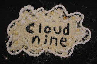
Cloud nineThis piece was created using flour, popcorn and shaving foam. Although shaving foam is not a type of food, it still worked very well on the piece. I chose to use the phrase "Cloud nine" because all of the materials/products available at the time were white in colour just like a cloud. I poured out some flour onto the black paper and gently pressed the edges inwards to create a cloud-like shape and discarded the excess flour. Once I had done so, I used the saving foam to outline the piece and added a few pieces of popcorn around the edges. Lastly I used my fingers to scrape away some flour in the shape of the phrase "Cloud nine" I really like the look of this piece but I feel that it could look whiter as it appears to be slightly yellowed in colour.
Food for ThoughtThis piece was created using a wide range of different foods including chewy-sweets, oranges, spaghetti, pasta, honey and salad-cream. The letters made from chewy sweets (f, r and g) were created by pressing and stretching the chewy sweets into letter shapes, almost using them like a modelling medium such as plastacine. The letters created using oranges (o, o and h) were created either by laying out pieces of oranges peel in the shape of the letters or by doing the same with orange segments. The letters created using spaghetti (o, t and t) were simply made by putting down a mound of spaghetti and using my fingers to mould it into the shape of a letter. The letters created using pasta (d and u) were made by laying the pasta-tubes out in the shape of the letters. The letters created using honey (f and h) were made by just squeezing the honey out in the appropriate letter shape. I made the outline using salad-cream and simply squeezed it around the outside of the phrase. I chose to use the phrase "Food for thought" because the saying has the word food in it which relates to the materials used in the piece as a fod-related pun of sorts. Overall, i really like the look of this piece as it is full of different styles and colours which makes it interesting and captures the interest of the viewer however if I were to do this again, I would use a wider range of colours to make the piece seem brighter and more full of life as many of the colours used in the piece are very similar.


No comments:

Post a Comment