Saturday, 28 January 2012
Final Project Evaluation
For my retail graphics project I had to come up with an idea for a shop, I decided to do a clothing shop as I shop most in clothing stores therefore would have a better idea of what to do for the project.
I am very fond of punk-clothing shops, particularly those in Camden so decided to do a punk-clothing store inspired by some of the brands that I visit/buy from often. For the project I had to design a logo for my company, packaging for my company and a swing-tag for my company.
These had to represent the shop well and my designs had to be memorable and interesting at the same time. I decided to call my shop "Dead Bunny" because there are many very popular punk clothing stores that use the name of dead or evil animals and they seem to have a lot of success (bye bye kitty, hell bunny etc.) The design of my logo is a skull with rabbit ears which represents the name of the company as skulls represent death and being dead and the rabbit ears on the skull represent the bunny being dead.
I used bright, neon-like colours and black because they are the sort of colours used on items in my punk-clothing shop, therefore they match and it represents the image and the products of the company well rather than being a complete contrast to what is actually sold as that would be confusing/misleading for customers.
My packaging design evolved as I was going through the process of experimentation and development, my net design was inspired by what is sold in my company's shop, it's a clothing store so I decided to make it in the shape of a t-shirt as it seemed an interesting yet rather simplistic shape to use. During my initial experimentation I used many different materials and techniques to try and make my net design look interesting and creative. I started researching punk clothing stores online and found a shop called Underground, I really liked the style and design of this shop, I'm not sure which artist designed it, I tried to look it up online but couldn't find anything. I used the idea of having the colour scheme of black and red on my final packaging design, I also decided to add photographic elements to the piece because I found the work of Martha Robertson and Alfonso Sotelo rather interesting as I felt that the photographs used on their packaging design had an effective and memorable look.
My swing-tag design has one new designed element and other "recycled" (reused from other sections of the project) elements involved. I decided to give my swing-tag many layers as it makes it more interesting to look at and gives the design more depth. The front layer is of a hand and it has the company logo on it and sizing information about the garment purchased. The other layers are things that I have previously used in the project, a lightning bolt from my packaging design, the "Rock" from the "Rock on!" design on my packaging, the front t-shirt shaped section of my packaging design and my designed logo. Because all of these elements link to what has already been created during the product, the swing-tag clearly matches the design of my other designs for my store which makes them look like they are supposed to go with one another.
I think my packaging design was very good as it was interesting and memorable, however I feel that the actual packaging itself could have been better, I could have added more tabs to make sure that there are no gaps between the edges and I could have made the flap that opens, bigger so as to gain easier access to the contents inside.
Overall I felt that this was a very interesting project that allowed me to explore some rather interesting techniques that I probably wouldn't have explored beforehand, now however I feel that I may like to complete more packaging in the future, I think that it's a fun project to work on that gains very interesting results.
Final swing tag design
 |
| This is my final design for my swing tag, it has improved since the first version. I have added many new elements to the piece, there is no longer only the hand. I decided to do this because it makes it more interesting and memorable as well as linking to my company well, there is now a clear link between my swing tag and my packaging design. I have now included the lightning bolt from my packaging in this design, the front t-shirt shaped segment from my box, the "Rock" from the "Rock on" typography that I created and my logo design in my swing-tag design. I feel that this greatly improves the overall look of my piece. |
Swing-tag design 1
 |
| This is my swing-tag design, I chose to do my swing-tag in the shape of a hand because 1) It seemed like an interesting and unusual idea 2) There was a hand on my packaging in the "Rock on" typography 3) It allowed me to show off some of the products on sale (accessories such as rings, nail stickers, cufflets etc.) I started off by sketching out my design in HB pencil, I then outlined the design using a black fine-liner, once I had done so I scanned the image into my computer and opened it in Adobe Photoshop where I proceeded to colour the design using the fill tool and the paint brush tool. Once I had done so I went on to place my logo on my design and lower the opacity slightly so that it didn't look too bright compared to the rest of the design. Lastly I added a text layer above with the information I wanted to give on my swing-tag before checking my design over thoroughly. I think that the piece came out quite well, it looks as I imagined it to and is bright, bold and eye-catching which makes it an interesting and memorable design, the only thing I would change about this design would be the fact that it is kind of a big contrast to the style of the design of my packaging, but perhaps that contrast works well. |
Anaylysis of 3 swing tags
 |
| This swing tag has been created by a graphic designer called Coco, she started off by had carving a stamp in the shape of the letters "C" "o" "c" "o" and the shape of a heart then stamped them onto the material before sewing it onto a page of a book. I really like this design as it has been created in such an interesting and unique way which makes it very memorable. This design has a typographical element to it and one pictoral element of a heart. It is a very simplistic design with a natural, earthly feel to it, I really like this piece, it could inspire me to create a hand-made printed swing tag of my own using interesting and/or unusual materials. |
 |
| This swing tag was designed by a graphic designer named Danelle Bourgeois, it is a very basic design yet it is also very effective. It appears minimalist, yet you can tell that a lot of work must have been put into creating this piece. There is no typographical element to this swing-tag, just a pictoral element of an owl placed slightly off centre on the flower-shaped swing tag. The owl design is very bold and made up of basic shapes, there is no colour involved on this swing tag, I think that adds to the piece, it is yet another element of effective simplicity. This design piece could inspire me to create something rather basic for my swing tag yet just as interesting and memorable as if I had put a lot of detail into, possibly even more so. I think that the owl has been printed onto the card, I could print a basic pictoral element onto my swing-tag. |
 |
| These swing tags were designed by a graphic designer called one hot mama, these designs have been made by hand even though they look like they were created using a computer/software. There are two layers to each of these swing tags, one is made of material and the other is made of card, the card layer is the patterned one. These swing-tags have only pictoral elements, though they are very well designed and rather beautiful. If there was a company name printed on this design it would be even better as it would represent the company and become an interesting way of remembering the shop/company for future reference. This piece could inspire me to hand-craft some interesting patterns or even to have a double layered tag. |

Final packaging design
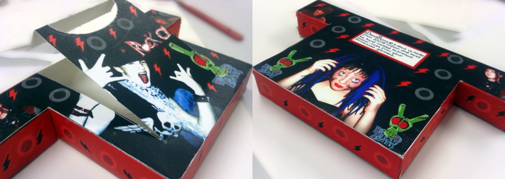 |
| This is my final box design, I think it came out quite well, the box folded together well and the design looks very effective. I designed this box so that it would be in the shape of a t-shirt, the curved handle is representative of the neck of the t-shirt. The only thing that I would change about this box would be to add tabs to the pull out section where the box opens. The colours on my box contrast well and the edited photographs look very effective. If I received an item of clothing in a box like this, I would want to see the rest of the products from the company as the design is memorable and captures my attention. I like the contrast between hand-drawn elements, computer-made elements and photographic elements as the combination of the different types of design upon this box look really interesting and effective once put together. The brightly coloured elements atop a dark background cause the colours to stand out more and appear brighter and more eye-catching. Overall I think that the making of my packaging went well however there could be some extra tabs used and the cutting of the edges could be neater. |
Elements used on my final net design
 |
| I designed each of these elements by hand, I decided to create the typography on my piece by drawing it out using a HB pencil rather than simply downloading a font, I decided to create my design in this style because it looks a bit like the sort of font you'd find on rock cds/posters etc. I included the "Rock on" hand gesture too as the first "o" as it helped to reinforce what the Typography says.I tried making the label on the back on my box using a typed-font, however I felt that it would have a more personal feel to it if I wrote it out by hand. I drew out the lightning bolts and small circles which cover my packaging by hand, then coloured them using the fill tool and the paintbrush tool on Adobe Photoshop elements 8. |
 |
| These are the photographs I used on my final net design, I took all 4 of these photographs using my digital camera (Kodak easyshare M320) I edited them using Adobe Photoshop. For each photo, I cropped out any unneeded space then deleted the background and coloured it black using the fill tool, I also adjusted the brightness and contrast settings for each photo and for some of them the sharpness of the image too. Once I had done so, I proceeded to add them to my final net design. |
Final net design
 |
| This is my final net design, I used Adobe Photoshop to create this piece. I started off by filling in the background of my design, because my shop sells punk clothing, I decided to use the colours red and black. Once I had done so, I proceeded to place my edited photographic elements upon the net in a way that made it look interesting/appealing yet also professional and memorable too. Once they had been place upon the net design, I inserted my logo and added one copy of it to the front of the box and two smaller copies to the back of the box to represent my punk clothing company. The next thing I did was add the "rock on" typography to the front of the box, I started off by using a downloaded font but then decided to hand-make the typography instead because it has a more personal feel and looks more interesting/memorable. I then added the label on the back of the box, this label was also hand-written for thee same reason as the "rock on" typography. Lastly I added the vector graphics of the lightning bolts and circles that I had created by hand and coloured on Adobe Photoshop previously all over the box as added decoration. Once I was happy with my design, I checked it over thoroughly for anything I wanted to add/remove before saving my completed design. |
Net design 1

This is my first draft of my final net design, I created this design using a mixture of Adobe Illustrator, Adobe Photoshop, Adobe Photoshop elements 8, Microsoft paint and pencil drawing by hand. I started off by designing my logo, which I drew out many different potential designs for, in many styles and eventually decided upon the logo used on this net which I drew out in HB pencil then scanned in to my computer. Once I had scanned in the logo, I proceeded to outline and colour the logo using Adobe Photoshop elements 8. I created the net outline using Adobe Illustrator, but first I designed it by hand and tested it out to make sure that the net would work. Once I was certain that my net worked well, I started to experiment with different styles and designs that I could possibly use, in the end I decided that a bright background with my company logo on top would be the best design for my packaging because it looked very interesting and represented my shop well. I opened the net design in Adobe Photoshop and proceeded to fill the background with two bright colours, I tried out Pink and green at first but it didn't contrast with the logo design colour scheme well enough, I then tried Yellow and purple but it looked too bright and the yellow didn't really work well for the company image, I finally tried blue and pink, which I really liked the look of so started to experiment with combinations of many different shades of these two colours. Once I had found a colour combination that I liked, I moved on to create the actual design of my net for my t-shirt shaped box. I inserted my logo in many different sizes on the top half of the net in a pattern which I thought looked quite interesting/appealing. I then copied and rotated the pattern of logos and placed them on the bottom half of my net design. Once I had done so, I proceeded to open the design so far in Adobe elements 8 and started with my background design. I used the paintbrush tool to create dots and splodges upon the net design, I also created a layer with quite a low opacity so that I could fill in the blue outlines that can be seen on the design around each of my logos. I edited the colours so that they became a lot darker, then filled in certain spaces with a light colour which stood out and created a sort of neon effect upon the piece.
repeated pattern

I created this repeated pattern using Adobe Illustrator. I started off by creating a box in which my vector images would be placed, I them placed my logo design within this box, laid out in an interesting pattern, making sure to overlap the images over the top of the box and one of the sides of the box, I then proceeded to colour the background purple as it seemed an interesting colour contrast to the logo. I then selected the images that overlapped on the left side and pressed Cmd+C to copy them and Cmd+F to paste above, once I had done so I went to object then transfer then move and entered the amount I wanted my selected images to shift so that they appear overlapping on the right side. I then selected the imags that were overlapping on the top of my design and pressed Cmd+C to copy them and Cmd+F to paste above, once I had done this, I proceeded to select object then transfer then move and entered how much I wanted my selected images to move so that that they were on the bottom edge and overlapping. After this I moved around the images a bit so that it looked more appealing/neat but made sure not to move any of the overlapping images. I then selected the design I had created and dragged it over to the fill swatch toolbar, I then created a box/space and filled it using the swatch I had created, I increased the size of the box and the pattern repeated well within it.
Resolutions for 2012
Three new years resolutions to help me achieve more in Graphics at College:
1.) Arrive early to get any unfinished work completed.
2.) On a Friday, make it to Graphics on time by catching an earlier bus.
3.) Put more effort into the work done out of class.
1.) Arrive early to get any unfinished work completed.
2.) On a Friday, make it to Graphics on time by catching an earlier bus.
3.) Put more effort into the work done out of class.
Net design experimentation
 |
| This is my first net experimentation piece, I used felt-tip pens. I started out by sketching the design onto the net using a hb pencil, I then went over the pencil lines using felt tip pens. I quite like this design as it is bright and bold and colourful which makes the design eye-catching and very memorable. For my final packaging, I could use a hand drawn element and even some bright, bold colours. This design is very cartoony and surreal which I think makes it seem more fun and appealing so would convince customers to come back to the shop. |
 |
| To create this piece of experimentation, I placed sections of tissue paper on top of my net and brushed water over the top using a paintbrush, the water caused the dye from the tissue paper to run through and stain the paper beneath, I then peeled off the tissue and what was left was this interesting design. I quie like this design as the method used to create it and the look of it is very unusual yet rather interesting too, at the same time. I really like the style of this piece, I could possibly use a technique such as this one to create a background or a fill element for my final packaging design. |
 |
| This piece of experimentation was created using old Christmas cards which I cut up and stuck on to my net design. I then used coloured fine-liners to add a few extra details (swirls, lines etc.) I think this design is rather interesting, I like the idea of combining different designs together. This design would appeal to those who are concerned about the environment too as it is made using recycled materials and therefore leads the buyers to believe that they are helping to make a difference and save the planet. The only problem with this design however is that it's made up of other people's work/copyrighted materials. |
 |
| I created this design using oil-pastels and crayons, I started off by sketching out the design I wanted to use using hb pencil and then proceeded to go over the design using oil pastels and crayons, I decided not to give it a background as I felt the colours would possibly contrast with the foreground design. The lack of a background however, makes the design look a little boring and plain, if I choose to incorporate an oil pastel/crayon design in my final packaging design then I will make sure to include a background colour in the design. |
 |
| This design was created using ribbons, which I then stuck down upon my net design. I quite like this design as it looks very interesting and is full of different textures and patterns which think looks very interesting. I could use a design made up of ribbons for the background or as a colour swatch for my final net design. |
Net and lock practice

We were given a net of a bag to create and had to cut, fold and glue each section together in order to form the finished product. The bag was relatively simple to put together and I managed to create it rather quickly, once I had made the bag, I cut out handles and stuck them on to make holding the bag an easier task. I also had to create a number of different locks which I could possibly use on my final design.I really liked the idea of a simple tuck lock as with my intended design of a t-shirt, it would work well, maybe on the side of perhaps coming from the actual neck of the t-shirt itself. Some of these locks were easier to create than others, there were a few quite complex ones however the majority of them were fairly simple. I really like the look of the more complex designs, however I don't think that they would work very well on my final net.


Final logo design
 |
| This is my final logo design. I used a pencil drawing that I had come up with during my experimentation and scanned it into my computer. I used photoshop to colour this design by using both the fill tool and the paint brush tool. I traced over the outline in black by hand using a graphics tablet. I quite like this design, it is bright and bold and I feel that it represents my company well as well as being interesting and memorable at the same time. |
Friday, 27 January 2012
cross-stich design
 |
| This is my cross-stitch logo design, I used colour fine-liners on graph-paper to create this piece, I quite the look of it as it is very interesting, it's an usual design which captures my interest. I think that this looks very effective and would be a good way to create a logo. Creating this piece was very time-consuming, but the overall look of the piece after id definitely worth it. I'm not too sure about the colours used in this piece however, I was experimenting with different colour combinations, I want to focus on bright colours for my logo design. |
Initial experimentation
  |
| These are my initial ideas for my logo, I experimented with a number of different techniques and styles. I used oil pastels, pencil on graph paper, ink, coloured pencil and pencil. My favourite of these is the ink, I think it looks very interesting and could be a good way of designing my logo. I have used the name "Death Bunny" though looking at it now, because the "bunnies" look dead rather than evil, perhaps "Dead Bunny" would be a better name. I think that the pencil on graph paper is a very interesting idea as it only allows for straight lines, but still looks interesting even with it's simplicity, I may include something like this is my final design. The oil pastels, I don't think looked that great, they seem a bit messy and big. I think that the pencil designs looks rather effective, however if I were to create my design using pencil, I would want to edit the designed piece using a computer programme such as Adobe Photoshop or Adobe Illustrator. |
Logo analysis

This is the logo for Cyberdog, a popular alternative clothing shop that sells all different types of clothing, bags, shoes, accessories and gifts that glow under UV lighting. This shop has only two branches, one in Camden and one in Brighton, yet it is famous worldwide for it's space-age feel, loud music and specialist lighting in the store, mannequins made up of wires and robotic parts and very unique set of products that cannot be bought elsewhere. The logo is a graphic of a robotic dog which represents the name of the company. The version of the logo which can be seen above has both graph and typographic elements as it has the image of the robotic-dog and the word "Cyberdog" written beneath, however on products that this company sells, only the graphic of the robotic-dog is actually used and not the Typographic beneath. The logo is very basic/simple in design which makes it easier to reproduce on mass, even though it's simple, the logo is very effective and looks interesting/unusual. The company use this logo on all of their products as well as being displayed around the store all over the walls/floor/mannequins, on clothing tags, on packaging, on the shop front and displayed on the massive robots that stand either side of the entrance to the store. The typeface used has been designed in way that looks like it has been made up of small squares, pixel by pixel, similar to the style of early computer games such as space-invaders which reinforces the space-age design of the store. The colours used on the main logo are a black background, blue for the robotic-dog, oranges and pink on the left side of the robotic-dog and green for the text. The black used for the background represents the darkness/blackness of space. The blue used for the robotic-dog is used as it contrasts well with the dark background and has a metallic feel to it. The orange and pink use on the left-hand side of the robotic-dog design represent wires and electricity/power flower through the design and giving the image power. The bright-green used for the typographic is representative of the early computer games in which bright green, blocky graphics were placed on a black-background. When the logo is placed upon different products/items, the colours are often changed/manipulated to the colour scheme of that product to aid the design. I think that this logo is very successful as it is both simple and complex, involves a lot of interesting colours, represents the company name and brand well and looks very interesting. The target audience for this logo are the people who shop for punk/alternative clothing and accessories in places like Camden Loch, Camden Market and Brighton, the majority of these people are punk, goth, alternative etc. I feel that this logo appeals to the target audience well as it is bright and eye-catching as well as being a dark, unusual, space-age design. This logo could influence me when I design my own logo, I could include a dark background with bright colours overlaid or a pixel-inspired font in my own logo-design.
 |
| This is the logo for hell bunny, it is bold, simple and memorable. This logo is both graphical and typographical as it involves both image and text. The typeface is Serif and is bold, each letter does not match in size/height to the others which gives a hand-drawn feel to the text. This logo has a graphic, the graphic is of an evil rabbit atop crossbones which represents the name of the company "Hell bunny". The company uses the logo on clothing, packaging, labels, shop-fronts, advertisements, bags etc. The same colours are always used on this logo, "black and red" the empty, white space is generally filled with whatever colour the background of the item the logo is upon. The logo includes the name of the company and an image that represents that name. This logo is simple as it is memorable and easy to reproduce. This a very successful logo as it works very well and sticks in your mind.The target audience for this logo is anybody who wants to buy female punk clothing. This could cause me to make my logo simpler and more bold. |
 |
| This is the logo for Criminal damage, it's a typographical logo as it only involves text. The typeface varies between serif and sans serif and is created in a way that makes it look like it's been scratched/carved out of something, this logo looks hand-drawn/edited, each letter is a different height and at a different angle and well as the size of each letter varying. The company he company uses the logo on clothing, packaging, labels, shop-fronts, advertisements, bags etc. There's never colour used on this logo, it's always in black as black is a dark, bold colour which is easy to see and is dark which helps to represent the type of clothing the company sells. The logo includes the name of the company. This logo is very easy to reproduce and is simple in design yet effective. This logo is successful and it's simple but memorable, however it's not a very interesting logo. This could influence me to create a typographical logo. |
 |
| This is the logo for Bye -Bye Kitty, it's a typographical and graphical logo and it includes an image and text. The typeface is sans-serif and is cold and in a hand-written style. The company he company uses the logo on clothing, packaging, labels, shop-fronts, advertisements, bags etc. This logo varies in colour and design, any colour can be used for this logo as it is constantly reproduced in many different colours upon many different garments/items. This logo has a graphic of a dead cat with a skull-ribbon atop it's head, evil eyes, fangs and cross bones. This represents the name of the company. The logo includes the name of the company and a graphic that represents the name. The logo is simple and very easy to reproduce, it is also memorable. This is a successful logo as it is easily reproduced, simple yet effective and memorable and it represents the company well. This could influence me to create a logo that includes both graphical and typographical elements. |
Retail MindMap

This is the mind-map we came up with in class on the Whiteboard. The mind-map includes everybody's ideas/possible ideas for their shop. It includes Shop Ideas such as "Music shop", "Game shop", "Book shop" etc. Target Audience such as "Young adults", "Party-goers", "Luxury market" etc. Possible name ideas such as "Okashi", "Rusty Needle", "Melody" etc. and Packaging ideas such as "ring box", "carton", "shoe box"etc. My own Shop idea was "Punk clothing shop" which I chose because they are the sort of shops that I spend the most time in and therefore know the most about and can easily research for inspiration. My Target Audience was "Punks" as that is who punk clothing is going to appeal to, this style of product is usually aimed at teenagers and young adults so it would probably be a better idea to aim my shop at Teenage/young adult Punks/wearers of alternative clothing. My Possible name idea was "I hate my life" however I do have other ideas such as "Underground Outfitters", "Death Bunny", "Electric Threads"and "AlTeRnAtIvE." My Packaging idea was a "bag" however I could also use name-tags, boxes(for shoes/jewellery etc.), gift-wrap etc.
Mood Board


Food Fonts
We were looking at Typography made from food and other household products in class, in particular we were looking at the work of Ed Ruscha. In response to the work we were looking at, we created our own hand-made food based typography. I had the opportunity to work with a number of different materials/products in my work. Each phrase I used relates to the materials I used to create the piece. I really liked using food as a Typographic medium because it's easily manipulated, comes in every colour, many different textures and looks very interesting once arranged as words/phrases.
 |
| Get Jammin 'This piece was created entirely using Jam. I started out by laying down a sheet of black-paper, then using a paint brush I spelled out my phrase "get Jammin'" I used that phrase because it has the word "Jam" in it which works well as a food-related pun. Using the paint-brush, the jam looked completely transparent so I stuck my fingers into the Jam-jar and proceeded to add clusters/lumps of jam to the piece all over the letter shapes. I quite like the overall look of this pice though I feel that if it were on a lighter -coloured sheet of paper then the red of the Jam would have been more striking and the piece would look better. |
 |
| Cloud nineThis piece was created using flour, popcorn and shaving foam. Although shaving foam is not a type of food, it still worked very well on the piece. I chose to use the phrase "Cloud nine" because all of the materials/products available at the time were white in colour just like a cloud. I poured out some flour onto the black paper and gently pressed the edges inwards to create a cloud-like shape and discarded the excess flour. Once I had done so, I used the saving foam to outline the piece and added a few pieces of popcorn around the edges. Lastly I used my fingers to scrape away some flour in the shape of the phrase "Cloud nine" I really like the look of this piece but I feel that it could look whiter as it appears to be slightly yellowed in colour. |
 |
| Food for ThoughtThis piece was created using a wide range of different foods including chewy-sweets, oranges, spaghetti, pasta, honey and salad-cream. The letters made from chewy sweets (f, r and g) were created by pressing and stretching the chewy sweets into letter shapes, almost using them like a modelling medium such as plastacine. The letters created using oranges (o, o and h) were created either by laying out pieces of oranges peel in the shape of the letters or by doing the same with orange segments. The letters created using spaghetti (o, t and t) were simply made by putting down a mound of spaghetti and using my fingers to mould it into the shape of a letter. The letters created using pasta (d and u) were made by laying the pasta-tubes out in the shape of the letters. The letters created using honey (f and h) were made by just squeezing the honey out in the appropriate letter shape. I made the outline using salad-cream and simply squeezed it around the outside of the phrase. I chose to use the phrase "Food for thought" because the saying has the word food in it which relates to the materials used in the piece as a fod-related pun of sorts. Overall, i really like the look of this piece as it is full of different styles and colours which makes it interesting and captures the interest of the viewer however if I were to do this again, I would use a wider range of colours to make the piece seem brighter and more full of life as many of the colours used in the piece are very similar. |
Si Scott Inspired Typography

Subscribe to:
Posts (Atom)